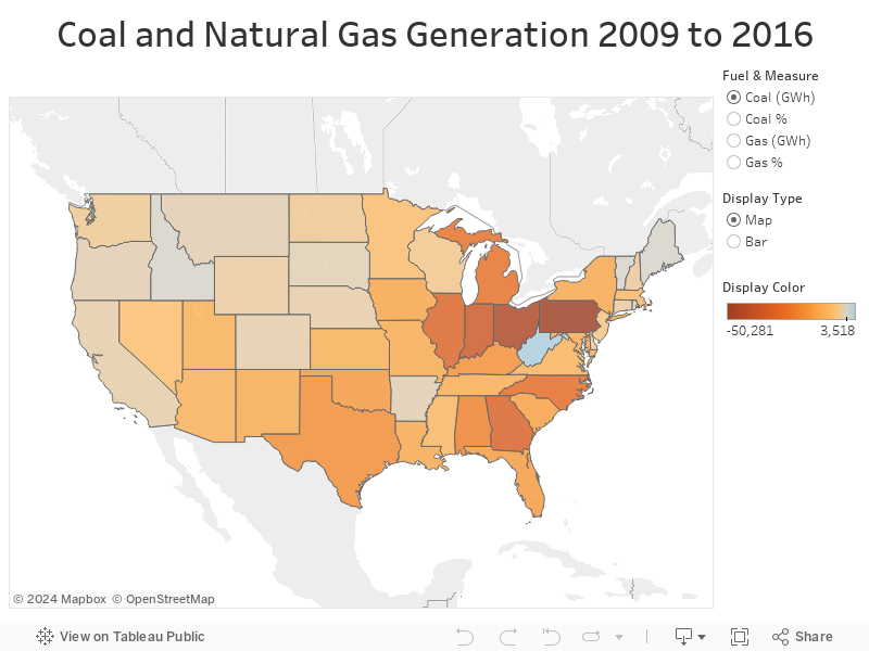
Page 10 of the June issue of Power Magazine had an interesting map showing the change in coal, gas, and renewable electricity generation by state. (Map can be found here.) I was able to use EIA data to recreate the chart for coal and gas in the lower 48 states. I was also able to add a little interactivity, so you can change from a map view to a bar chart view, and can now see the percentage change as well the absolute change in the generation by fuel. By using the viz you can see that while Pennsylvania had the biggest drop in the amount of coal generation in the seven years, at 48%, it was only the tenth biggest drop on a percentage basis.
You can use the viz embedded in my blogpost below, or the viz is also available on Tableau Public here.